

eCommerce Responsive Design | Yun Wei Tea
a design project redesigning existing e-commerce site
Role
Sole UX/UI Designer
Timeline
4 weeks - 20 hours/week
Tools/Skills
User Research, Information Architecture, Wireframes, Sketch, InVision, Maze
Challenge
How might we make the website:
Less minimal and barebones
More user-friendly and responsive
Develop the overall brand to be simple, neutral and educational
Solution
Research helped identify the key differentiations Yun Wei Tea has against its competitors and what areas they were lacking in their current website. Through testing and iterations, Yun Wei Tea was successfully re-designed with a simple and clean focus on the origin story of the tea.

01. Discover & Research
Research Findings
Because Yun Wei Tea does have an existing website, I was able to connect with the owner on some of initial insights he had in the tea space. However, in addition to the insights he was able to provide, I also wanted to understand the general market. And so, I started off with some market research and found some basic stats on how much tea is consumers, types of teas and the demographic of who consumes tea.
Secondary Research:

Competitive Analysis:
Secondary research only provide a very general overview of the tea enthusiasts so to dig a little deeper, I looked into the competitive space. Because Yun Wei Tea specialized in a niche category of tea, in addition to my own research, I also worked with the owner to identify who he believed were the key players in the space.
Among them were the following below, which primarily focused on specialty Chinese teas. Some brands carried other selection but mainly Chinese teas:

Interviews
To further my understanding of who the consumers were, I conducted surveys with 9 participants, to see what motivated them to buy tea. Specifically, I wanted to identify what factors make them try new types of teas and what information would help push them down the purchase funnel. From the interviews the main factors included:
Taste, Convenience and Caffeine
Recommendations from friends and relatives
Ability to sample a selection of teas
02. Define
Persona & Empathy Map
The following persona, Erica was developed based on the research phase to paint the picture of a Yun Wei Tea customer. By providing a brief description of who they are and outlining their needs and frustrations, I was able to envision who would shop at this site. Diving deeper, the empathy map was created to help categorize Erica’s thought process when thinking about buying or trying new teas. This helped push me to think about what would be valuable to add to the site.


Project Goals
The Venn Diagram was helpful to see the overlap in the business and user goals when buying tea. From connecting with the owner, I knew that increasing sales was only one small piece of the pie and the bigger picture would be to provide more information and details around the products. This was clearly and important aspect that would need to be incorporated into the site because the existing site was extremely minimal with not a lot of context. By including more details like the origin story of the tea and how to brew the tea, it would bring more consumers to explore the product pages and drive more sales, therefore benefiting both the business and the user.

03. Ideate
Site Map
Given that that Yun Wei Tea has an existing site, and with good bones to build from, I started off evaluating the site before outlining the information architecture. Because the brand has a limited selection of types of teas to choose from, in this instance, the site map is very straightforward with the types of teas, products, and product details.

User Flow
While the user flow of an eCommerce site is quite standard, especially in this scenario, I still wanted to outline how the user would go through the site when looking for the product.
Scenario:
Erica is looking for an Oolong tea.

04. Design
Going into the design portion, I kept in mind that Yun Wei Tea’s brand objective was to have a clean and simple interface that also tells a story to their consumers. So while their current interface was clean and simple, it was too minimal and did not have the characteristics that the owner desired. The homepage categories were identical to the product page and was also not very inviting a global audience. So, taking in the elements that could use improvement, I went on to draft up the wireframes for the future website design.
Current Website Design


Wireframe
Based what was lacking from the above, I built the following wireframes with to include the missing pieces. Since one of the business objectives was to get more sales, including the CTAs were the first items to include on the homepage so the users would be prompted to click into it. It was also important to feature specific products and not just throw in the all of the categories as the original website had outlined. Secondly, the product page listed out all of the teas with the option to filter on the top as opposed to having an identical selection of categories as the homepage. Lastly, because the owner and users wanted more information about the product, I broke down the product details into more digestible pieces as opposed to having one big paragraph. This will also allow the business to showcase pictures of the tea cultivation process.


UI Kit
From there, I started brainstorming for the UI Kit using Pinterest, and Instagram to get inspiration from tea brands. I mainly looked for color schemes around green since tea plantations are very green and with the owner’s intention of having a story around the products, I wanted to follow through with the theme. From there I gathered some imagery that would encompass the the tea’s brand, something natural, clean and simple.

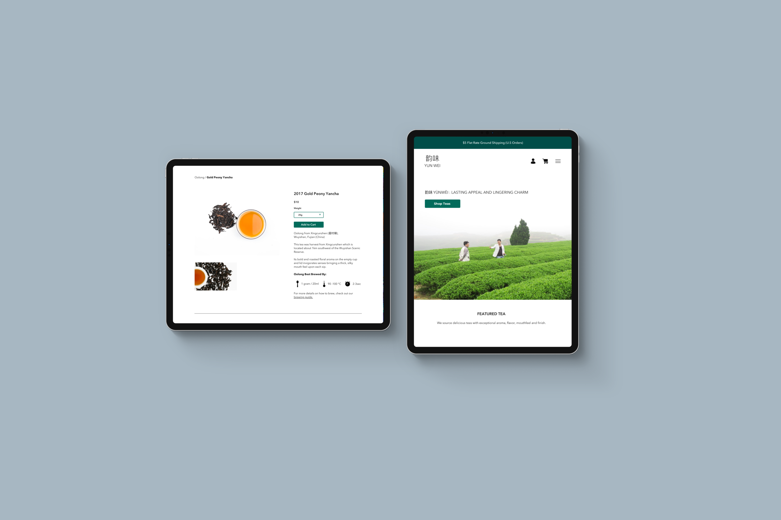
High-fidelity Design
Once I established the characteristics of the brand within the UI Kit, I applied it to the original wireframes, creating the responsive screens below:

05. Iteration & Implementation
Using the tool, Maze, the high fidelity prototype was tested with 6 participants to understand how the participants would navigate through the site and identify the areas for improvement.
Successes & Feedback
Straightforward navigation and nice design
100% completion
Testers had some trouble finding the sampler flight
The add to cart indicator blended in with the green background
Users were slightly frustrated that they had to go back to “Shop Tea” to find tea listed from as the assigned task
Iterations
Drawing from the feedback provided through user testing, revised the prototype to account for what users struggled with the most. This included:
Updated the name “Yun Wei Tea Flight” to “Yun Wei Tea Sampler Flight”
Changing the cart indicator from green to yellow (iteration 1)
Adding a dropdown navigation for users to easily go to shop-able tea categories (iteration 2)

Iteration 1

Iteration 2
Final Product

Key Takeaway and Next Steps
For this project, because Yun Wei Tea already had an existing website, it was easier to build out the information architecture. However if I had more time, I would have wanted to work with the owner to flush out the origin stories of the teas with the stakeholder. Additionally, I would have wanted to add more dimension and dynamic to the homepage by adding a video instead of an image.
Next Steps:
Build out the rest of the website
Continue to iterate and make changes based on user testing